

Phoibos Apollo Titanium Review | Great Quality, But…
(This page features affiliate links, for more information click here.)
On paper, this should be one of the best brands I've ever reviewed. Top-tier specifications and build quality at an affordable price with an original design. What's not to love?
That last factor's been absent from many rival far-east offerings up until now, with the majority fully committing to the lucrative 'homage' route, where they rebadge other's designs for low prices. Phoibos has been going against the grain in recent times, with a string of bold, experimental designs that instantly stand out from the crowd. I've had them on my radar for a while, so when they reached out asking if they could send one of their new models my way for review, it was a no-brainer.
If you're wondering if these peculiarly named pieces are worth a pick-up, keep reading.
Packaging
How come every microbrand ships their watches in better boxes than the big brands? Cost-cutting, I expect, as this Phoibos arrived in a robust nylon-coated box with a snap fastener and a faux suede lining. While not particularly impressive, you get the impression that they care about the product arriving intact.


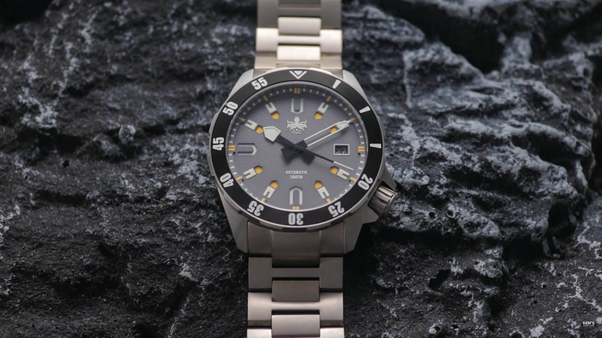
Within is the Apollo, which is designed to offer some bold aeronautical galactic theming. Honestly, I could see this at home on Darth Vader's wrist, especially the black-colored version.
Price
This is one of Phoibos' most expensive models, though it isn't very pricey in the grand scheme of things, coming in at just $400 at the time of publishing. The brand has jumped on the titanium hype train, with this being their first release in that material, hence the price increase over the more easily produced steel models.
Watch Dimensions
It's also bigger, coming in with a 41.2mm diameter, a 12.8mm thickness, and a 48mm lug to lug that extends to 52.8mm when the protruding end links are considered.
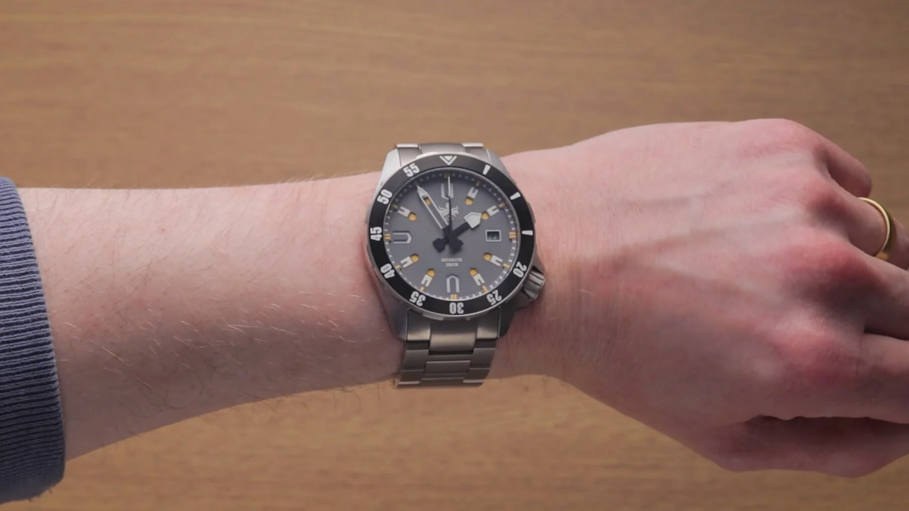
Unsurprisingly, the Apollo best accommodates larger arms, dwarfing my slim wrist. Phoibos has smaller alternatives on their site if you're skinny wristed, so my quality analysis could still prove helpful.
Case Construction
The case shape is reminiscent of the Signum Cuda dive watches that I looked at for my small diver roundup, with a Seiko-like body modified to a more angular structure.


Phoibos originally had this watch listed as having an UltraHex coating, which I found unusual considering that rival brand RZE markets this as their proprietary, trademarked coating (review of that watch here).
I contacted RZE to check for any connection, but Phoibos allegedly falsely used the term on the listing. They claim to have been misled by their coating factory, thinking the term was the industry standard name for this type of coating. Naughty naughty!
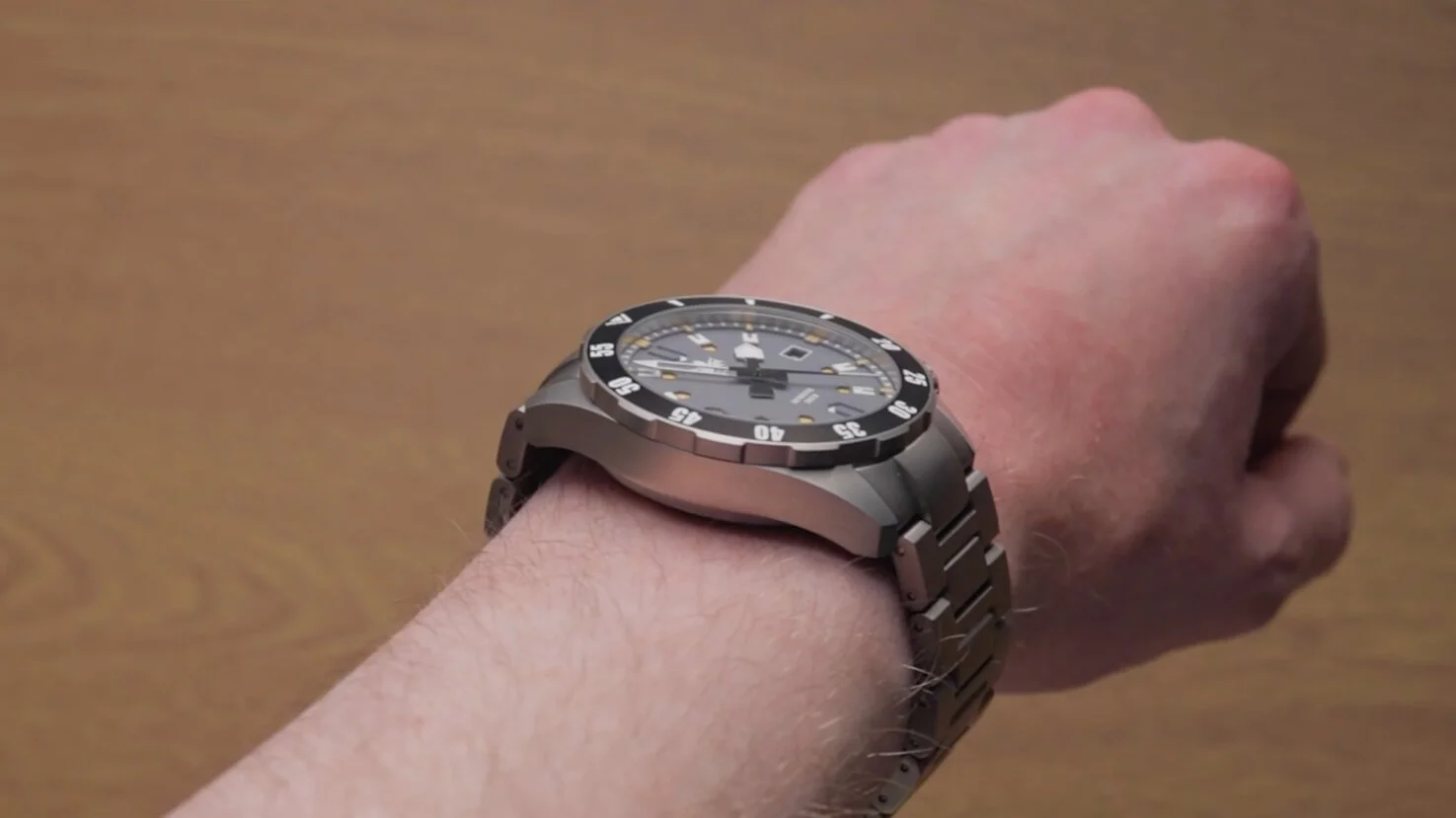
Still, there are clear differences between the surfaces, with this Phoibos having a glossier, smoother finish that I think looks slightly better but won't hide scuffs and scrapes quite as well. It also has a somewhat lower hardness rating than the RZE but is still much harder than 316L steel if the 800Hv is to be believed. Despite the basic case shape, it is strikingly well cut, with extremely defined edges, to the extent where parts of the underside are quite sharp, especially towards the lug area.
Due to the way the watch sits (or hovers) on my thin wrist, I can't confirm whether this would irritate those with manlier proportions, but it might be worth checking with thicker-armed reviewers for clarification.
Crown & Caseback
Perhaps the most prominent part of the watch is the large crown that juts out at 4'oclock. Whether this has been designed for easy operation while wearing spacesuit gloves, I'm unsure, but the sheer size of the thing ensures that grip won't be an issue. To some extent, I think it's overkill as it leaves the watch looking rather lopsided, and as opposed to the likes of the Seiko Willard, it doesn't have a wide case to blend into.
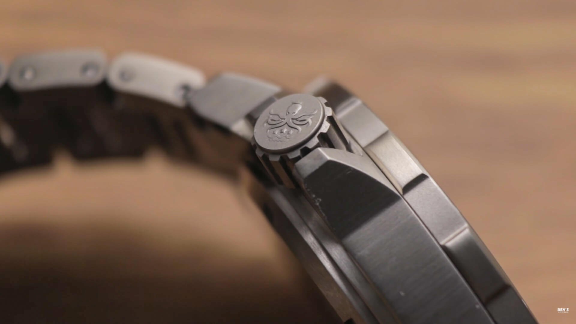

As expected, it performs admirably with a smooth motion and a long threaded section to aid the water performance. I don't doubt that this Phoibos hits the 20ATM designation either, as the overall construction of this Apollo feels exceptionally sturdy, especially the thick, screwed case rear. Here, a lasering of a spaceman stood in a highly questionable pose, which will instantly be recognizable if you're familiar with early 20th Century history. The guys at Phoibos might want to revise this on future releases. Perhaps 'hail hydra' would have been a more appropriate alternative, given the Octopus branding elsewhere on the watch.
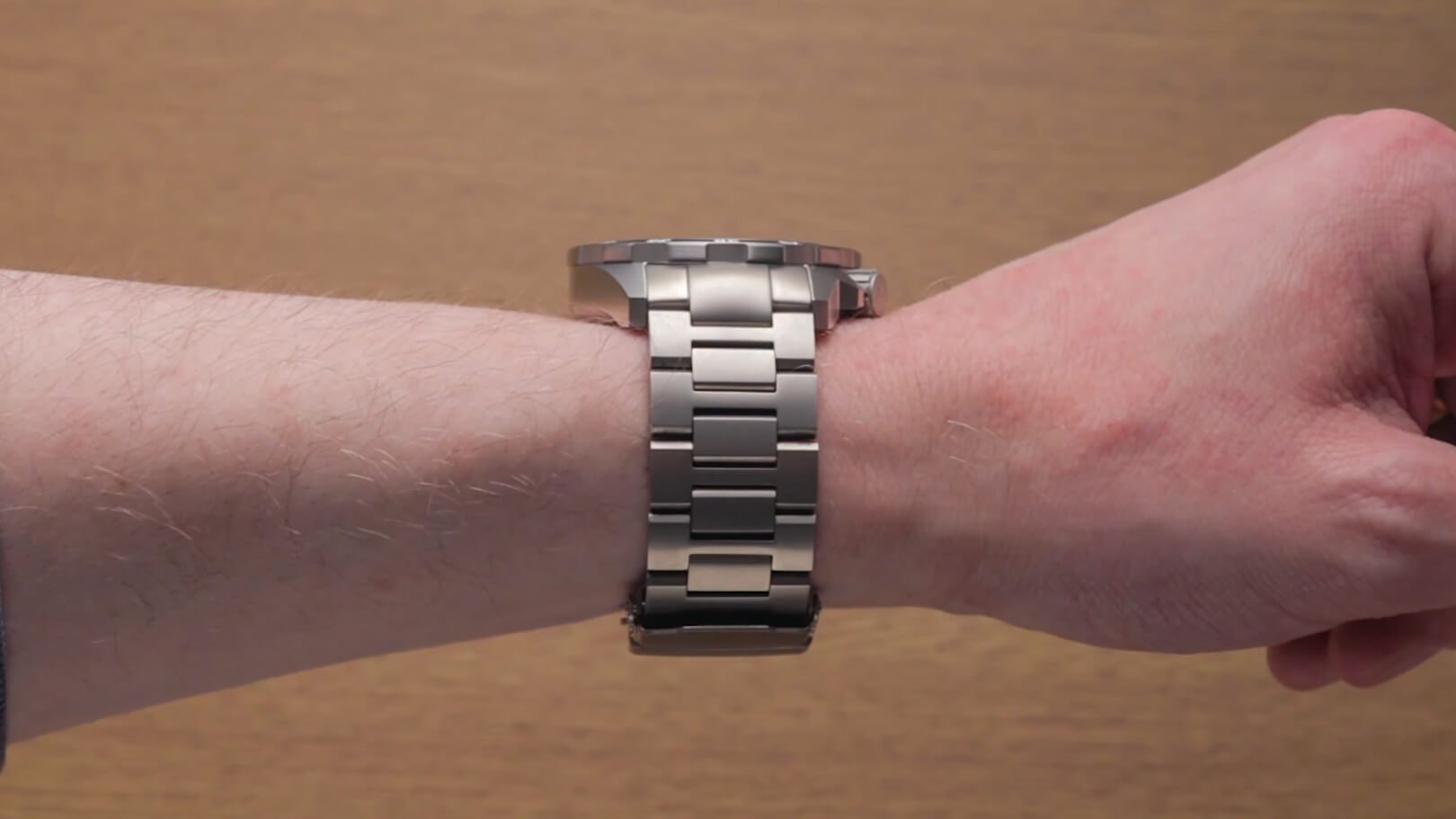
Watch Bracelet
Something else that may or may not need revising is the bracelet. As you can tell from the color, this is also titanium. As with the RZE, quality isn't the problem. That fitted to the Apollo is arguably even better with less rattly solid H-shaped links and another milled clasp that's smoother to operate. However, the same old issue has cropped up again. The tone of the bracelet is a far worse match to the case than the similarly afflicted RZE.


Even if you're not a fussy person, you'll probably notice this within seconds, and it's one of those things you can't unsee. This inconsistency isn't showcased in the renderings of the watch, where the titanium sections all appear in a matching, near steel-like color that isn't representative of the piece in reality.
If RZE is to be believed, then it's increasingly difficult to match up the color of a titanium case and bracelet the further up the hardness scale you go. Perhaps I should give Phoibos some leeway here. If true, this would explain why many Citizen watches that I've looked at have exhibited the same shortcoming. If true, RZE has still better matched the two components while maintaining a higher-hardness level.
Crystal
At least Phoibos hasn't cut corners on the glass. The sapphire crystal in place here won't let you down, mirroring the scratch resistance offered by the case and the AR coating does a fair job of preventing obtrusive reflections.
Design
Something I can't accuse this Apollo of lacking is personality. I know you've never seen a watch that looks quite like this one, as the aesthetic here is very quirky.
Let's begin with the bezel. The only way to describe this is a castellated variant of a scalloped bezel featuring wide gaps between each raised portion. Surprisingly, it doesn't hamper grip too much, with the lightweight bezel remaining easily rotatable despite the low number of grooves. The action is pretty good with minimal back play, and the alignment is perfect, though it doesn't exude the most confidence-inspiring sound when in motion.


While the etching atop is precise, it also houses my least favorite part of this whole package…just look at that font! It looks like the generic Impact typeface that your Nan would use on a PowerPoint presentation, right above the infamous Comic Sans. While very legible, I honestly think this cheapens the piece's look significantly. If they were to ever release a smaller version of this watch, they'd have to switch this out for me to be tempted into buying one.
Dial
Now the worst aspect of the watch is out of the way, let's move on to the best part. The real reason I wanted to take a look at this watch…the dial. The Apollo features an intriguing sandwich dial, with many holes punched through, revealing lighter colors beneath. I think the amber pairs very well with the grey dial, and it's interesting to see what they've attempted with the segmented hour markers, where only half is submerged. I like the inner sections, but the white parts look like lego teeth, and I'm not a fan of those thrown in at every 90 degrees. Their addition just reduces the consistency. Perhaps these could have been solid, like the hour hand, to give a cleaner, clearer look.


The handset itself is rather peculiar, with the hour hand possibly drawing inspiration from a shovel, with a cartoonish shape and tip large enough to potentially dig your way out of trouble. This is paired with a skeletonized minute hand that, again, I'm just not quite feeling. Outside of the black counterweight, it looks like it's been stripped from a different watch, which is never a good thing. At least the low-profile second-hand fits the bill and extends right out to the chapter ring. The low-light visibility is also very impressive, with the watch's readability ironically being better in the dark, with bright, long-lasting, two-tone performance.
For some reason, I expected the Octopus icon to glow; alas, it doesn't boast any luminescence. I like the little mollusk and definitely prefer it over the generic written version of the logo. It's symmetrical, distinctive, and well-sized without looking garish, though the latter is up to your interpretation.
Watch Movement
Another nice touch is the color match date wheel which partly makes up for its awkward position far to the left of the chapter ring, which is likely necessitated by the movement used.

Let's be real; you've probably already guessed what's on the menu here, as it's in virtually every microbrand watch. Bingo, it's the NH35. Seiko's well-regarded movement provides reliable low-beat-rate performance, hacking, and hand winding. It is much quieter than the equivalent Miyota automatics, so it's the obvious choice when available. It won't set the world alight but gets the job done.
Final Thoughts
Overall, I think this Apollo is a well-built watch, but some divisive, questionable design decisions would push me towards their other offerings or a large alternative diver.
