

Swiss Watch Company Review - They Know I Hate It, But They Sent It Anyway!
(This page features affiliate links, for more information, click here.)
I’ve reviewed a lot of watch brands over the years here at Ben’s Watch Club. ‘Brave’ is not a word that usually comes to mind. Nevertheless, it’s probably the best way to describe the watch we’re looking at today. You see, they’ve sent me a watch for review, knowing full-well that I may rinse them in front of 200,000 people.
The brand in question is called Swiss Watch Company. It’s a small manufacturer who’s been making watches for other brands and the armed forces since 1996, and launched under their own banner in 2018. While their watches are Swiss-made and registered in Switzerland, according to their website, I believe their offices are based in the US; a comparable setup to the likes of Hamilton.

While they may not have the heritage of Hamilton, they do have similar pedigree among many watch enthusiasts. More specifically, my fans! Indeed, I’ve seen numerous comments to the effect of ‘the watch you’re reviewing is good, but my SWC is way better!”
This has always left me wondering, are these viewers right? Are these among the best value watches you can buy? Unfortunately, one thing has held back this pursuit. This…this is the Swiss Watch Company logo. Now, this is going to sound super snobby, but I’ve never loved it. In fact, I’d go so far as to say I actively disliked it. I even featured it in a WatchCrunch post about the worst watch brand names and logos. Not a place you want to be.
So, when they reached out via email, asking for a review, I was caught in two minds. Half of me wanted to see if the hype was real, while the sensible part of my brain didn’t want to accept the invitation to roast a modest family watch brand.
That was until I read the rest of the email, where Jacob revealed that they had seen my criticisms, but wanted to send me one anyway.
Now that is the response of someone who is confident in their product! When you’re guaranteed to receive at least one roasting, but still want to put it on the chopping block!
So, they’ve consequently shipped me two of their watches… let’s see if they’re any good.
Packaging
One thing that is surprisingly good is the packaging. Unlike most microbrands, the leather pouches that these watches ship in aren’t generic in the slightest. If anything, each has its own individual look, due to being made from slightly different cuts of leather; you’ll see this pair have a slightly different texture and tone.
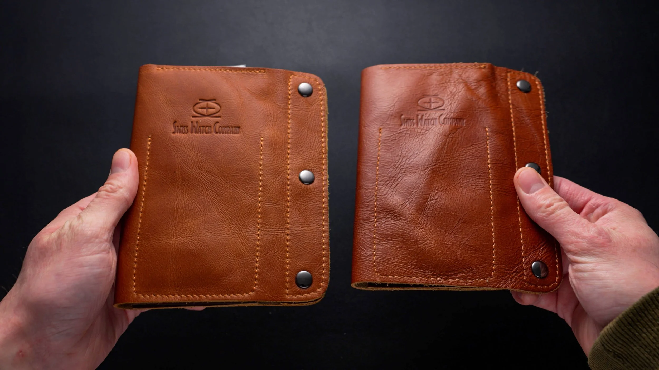
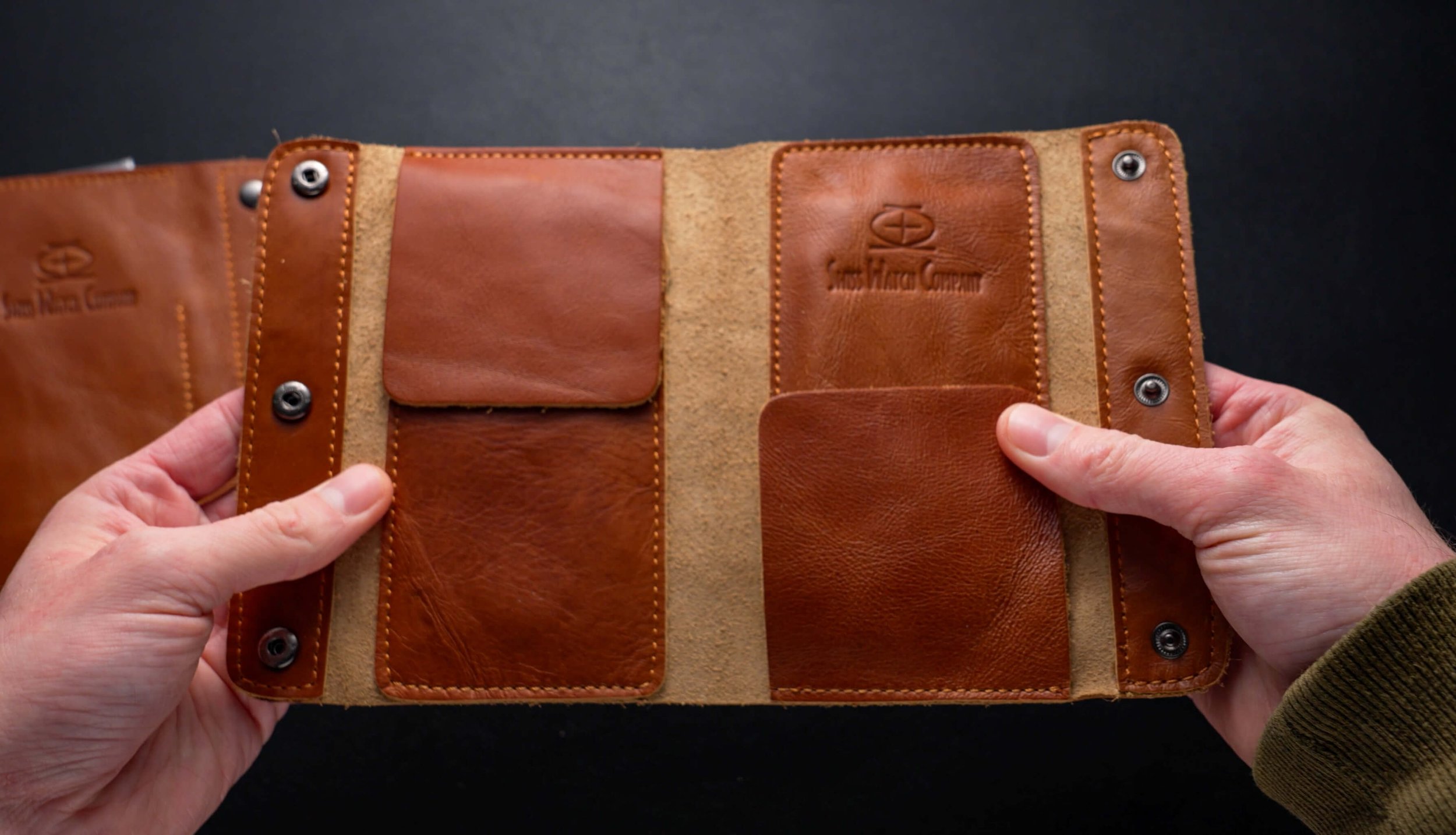
Functionally, these pouches are head and shoulders above most alternatives. They can easily double up as a dual watch travel solution, which is a notable value add versus most throwaway boxes. This approach feels organic, functional and refreshing.
Trench Watch Review
Ok, the two watches inside are the Trench and the Ark. The Trench is a hand-wound mechanical watch, while the Ark is a standard quartz piece.

Let’s focus on the Trench first, as I believe this is the newer model, and it’s also the one that costs the most. My expectations are pretty high considering the £487 or $595 USD price point. After all, this is approaching Hamilton territory for a watch brand that most people have probably never heard of; it also won’t fetch as much back on the used market due to the lower brand recognition. So, the stakes are even higher, especially in this current economic climate.
Build Quality
I’m glad to say that in terms of build, this watch checks all of the boxes. For one, the case is beautifully thin, in a similar fashion to the Hamilton Khaki, clocking in at around 7.5mm, with the domed crystal pushing that up to just 9mm. It’s insanely sleek on the wrist, and I’m glad they capitalized on the thinness enabled by a hand-wound movement. Its 38.5mm case is a little wider than some other field watches I’ve reviewed and wears more like a 39.5mm watch from my experience, but it will still service all but the largest arms. Lug to lug is 45.5mm, too, so there’s no chance of overhang.

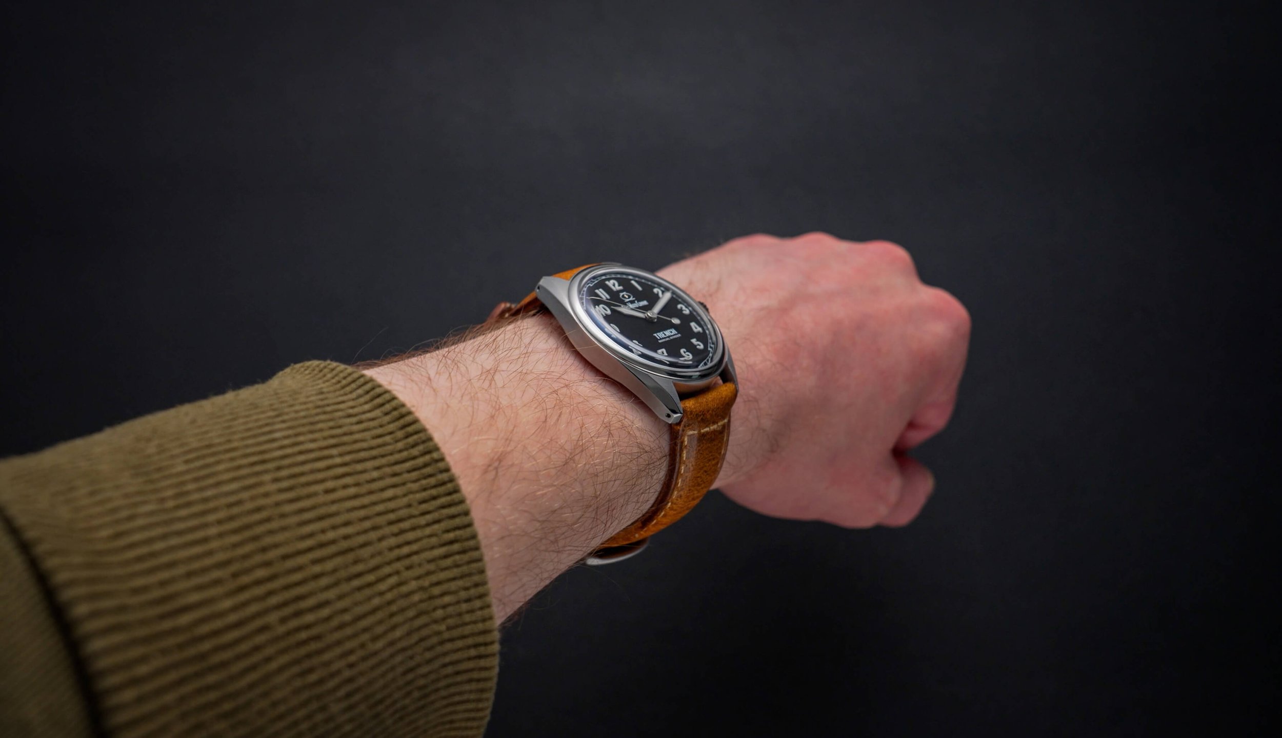
Not only is it sleek on wrist, but it’s even more comfortable than it looks. You’d never know from appearance alone, but this watch… it’s not actually stainless steel. No, despite the silver, steel-like appearance, this watch is completely constructed of Grade 2 titanium, meaning it weighs a mere 48 grams with the included leather strap. Without the strap, it sits below 32! What’s more impressive is the level of finishing. Some manufacturers justify exorbitant prices for titanium watches by citing how difficult they are to work with. However, Swiss Watch Company has smashed that notion with a precisely executed surface that easily could pass as a high-end steel watch. The brushing down the sides is very neat, and the polished areas are indiscernible from the likes of the much-lauded titanium Casio Oceanus models, with a near-mirror finish across the chamfers and bezel. For those of you who appreciate a sharply cut timepiece, you won’t be disappointed either, as the edges here are as razor-like as you can safely get. Great work, SWC!


This case has drilled lugs, for more convenient strap changes, despite some straps featuring quick-release tabs; we’ll get to that in a moment.
Water Resistance & Crystal
Now, the Trench doesn’t have a screw-down crown, likely because it could induce increased wear on the crown tube threads. Still, so long as you ensure the push-pull crown is compressed, the 10ATM water resistance should serve you just as well in the ocean as no man’s land, if that’s where life takes you.

Another component that can take some punishment is the crystal. It’s a sapphire crystal that’s presented like a vintage acrylic crystal, with a raised, boxy shape that suits the dial really well. While sapphire is the best versus scratches, it can induce cloudiness and limit legibility under harsh lighting. Luckily, the extensive treatment SWC uses means that legibility is rarely an issue. According to the product listing, this uses 16 layers of anti-reflective coating, as well as an additional sapphire coating to improve the durability further. In all honesty, I probably need some sort of proper testing setup to test different watches fairly in this regard, but that’s a problem for future Ben!
Dial
This stacking methodology continues when it comes to the dial. While from above, the watch appears like you’re typical vintage-style military watch, from the side, you’ll notice something a little peculiar. The printed numbers at each hour have what I can only describe as piles of lume on them, to the extent that they almost look like three-dimensional applied markers. Now, I assume these are applied by hand, and if so, they have done a meticulous job with perfect placement, which must be difficult for something so small.

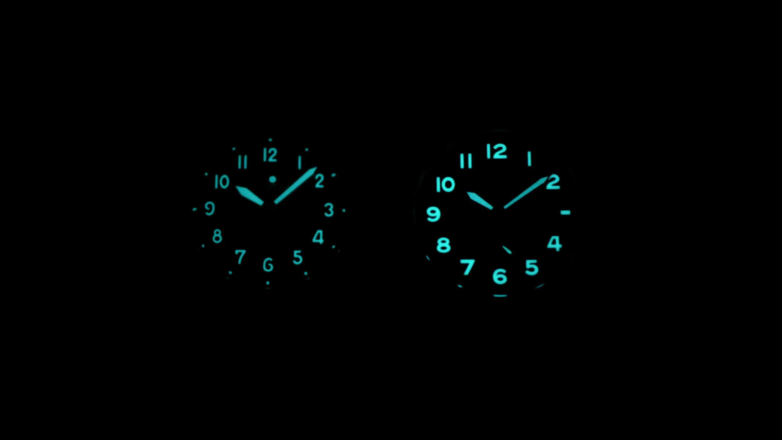
As you can probably guess, the low-light performance is consequently excellent, with a long-lasting blue glow. It’s up there with the Erebus that I recently reviewed as one of the brightest, too, though I no longer have that one on hand for a direct comparison. Here’s how it shapes up versus the Casio Oceanus.
The only nitpick I have on the finishing front is the hands, which have more scruffy edges and marks than I expected, considering the premium execution of the rest of the package. While the finishing style is different, the final result appears cleaner on the lower-end Ark.
Ark Watch Review
In fact, before we get to the visuals, let’s skim over that one too. The Ark they provided me with shipped on a velcro nylon band, rather than the two-piece leather strap that came with the Trench. Unsurprisingly, the more expensive model has a better one, and while it’s only genuine leather, it has already started aging nicely with a slighty lighter grain peeping through. Still, I’d say the nylon option is serviceable, considering the Ark’s lower £185 or $225 price tag. It’s got a slight stretch to it and is fully adjustable, as you’d expect, though, at some point, the velcro will inherently cause the strap to look raggy. In the short term though, it’s very comfortable and feels secure enough for weekend ventures, it feels far better quality than that on the lowly Timex Campers, but I could understand if this isn’t to your taste. It doesn’t have the quick-release notches found on the leather one, so you will need a pointy tool to swap it out.


Fortunately, almost everything else has been carried over. As I mentioned earlier, this one is powered by a lower-end quartz movement, which is mirrored by the lower cost, but aside from that, the watch still has a titanium case, 100m of water resistance, a sapphire crystal, and tremendous lume.
Overall, the Ark has a more rugged, casual vibe compared to the somewhat dressier Trench. This is mainly evident by the blasted case finish, which gives a subtler matte surface, which should show scratches slightly less. It does look lower-end than the Trench, but holds its own against others in a similar price bracket, especially considering it’s titanium. The main structure is, as far as I can tell, identical to the Trench, with the only exception being the flat bezel. The dimensions are the same; it’s just a tad thinner because it has a flat crystal. It even has a screw-down crown, so it likely fares better aquatically.

Unusually, possibly due to the remodeled, thinner bezel, the Ark still looks larger on the wrist. Some of this could also be due to the heavily stylized curved dial on the Trench, which reduces its visual presence from above. It’s also worth mentioning that the two longer hands are nicely kinked to accommodate these arced edges.
Despite the extensive dial text, I’d say the Trench is narrowly the better-looking of the two. While it’s not nearly as committed as the likes of the Vario 1918, it still brings a vintage aesthetic, incorporating stencil-like numbered markers, a sunken chapter ring, and a high-contrast color scheme. I see hints of both field and pilot watches in here, though this dark colorway provides enough versatility to almost stretch to dressier territory, especially in combination with the fancy case finishing.
The Ark, still has some retro cues, such as the shape of the small second hand and the bold typeface used for the numbers. This one feels less Art Deco and more Americana, with the result being extreme legibility at all angles.
Branding
Of course, it’s difficult for me to look past anything but the logo. Yep, it’s that time.
What I will say is that branding is far easier said than done. We’ve struggled since 2019 with branding for Ben’s Watch Club, and we only just landed on something that we’re pleased with after 3 attempts. Even professional designers suck half the time!
That said, branding for YouTubers is far less important than for product retailers, and that’s doubly so for watches, where appearance is often a make-or-break factor. It’s a credit to Swiss Watch Company’s build quality that they’ve had so much success despite this logo, as to me, it majorly tarnishes the cleanness of the designs.
Instead of ranting about it, I’m gonna try and identify specific reasons why I think it doesn’t look good to inform future changes. I saw in a comment on an existing review that they were considering a logo switch already, so hopefully, my feedback proves somewhat useful.


Firstly, fitting 17 characters into a single 8mm line is a Herculean task. You can’t read the logo at a glance, which is a big miss; if there’s one thing that big corporations do well, it’s instant brand recognition. You don’t get that here with a font this tiny and crammed together. I’ve heard SWC has some potential trademark issues preventing them from using the initials SWC on the dial, which would have looked much cleaner. If the full wording has to stay, it surely needs to be spread across two lines, with the icon removed to compensate for this.
Additionally, the cartoonish typeface present is far from the most legible, contradicting the otherwise utilitarian nature of their designs. I’m not saying make the text bland and generic, like loads of AliExpress brands, but something with more of a clear-cut appearance that better matches the quality of the product would definitely be appreciated. The font used for the “Trench” text is certainly better, though I’m not sure that additional dial text needs to be quite so huge.
Alternatively, you could do away with the wording entirely and rework the icon instead. The existing one needs to go, as you can’t even tell what it is or if it has any relevance or meaning. The hand-drawn vibe also doesn’t work so well for symbols, as it looks like a schoolbook doodle, so I’d scrap it or at least heavily update it.
A brand that’s recently succeeded in this endeavor is Christopher Ward. Their previous text-based logo was pretty grim, leaving many of their watches looking lob-sided. Their overhauled dual-flag logo is far more appealing and even serves as a nod to their Swiss-English setup.
Final Thoughts
With a logo change, my recommendation would be substantially higher. I don’t think they’re industry-shattering, as some commenters have claimed, but they are worth buying if you can look past the logo.
In some ways, this echoes my review of the excellent Orient Mako Sport, which was spoiled for a single, far more embarrassing reason. You can check out that video here to see what went so wrong…believe me; you won’t be able to guess it!